So a few days ago I wrote a little bit about a feature called Focus that I am, ha ha!, focusing on.
This feature is necessary for growth because it’s not about expanding the app and trying to be more competitive on features… it’s about delivering instant success for trial customers (as well as less friction for our current customers!).
Here’s the problem:
Right now when you want to track time in Noko, you can do it from any screen using the floating Quick Entry box. You can also log using a timer, which pops up in a separate window, or the equivalent on your phone. And that’s… it. (Not counting the API.)
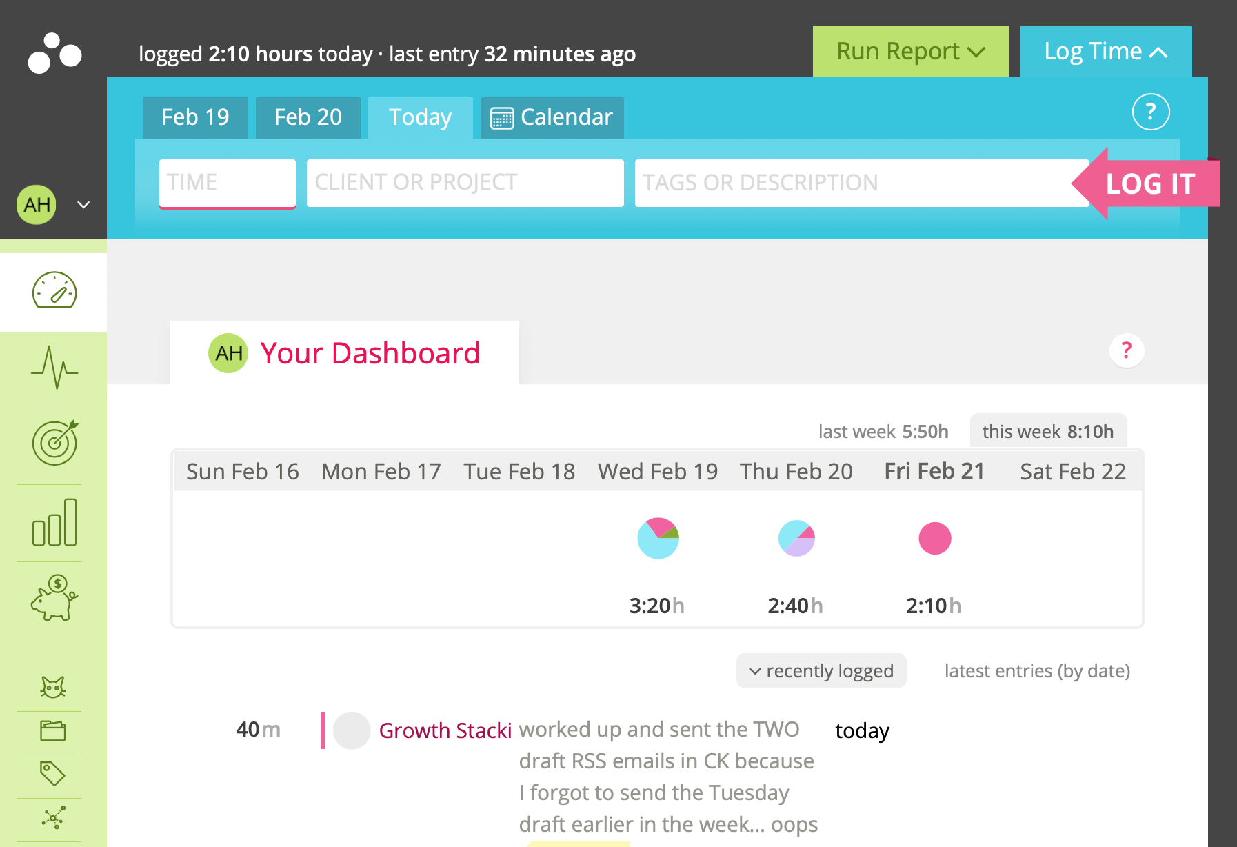
We don’t have a *dedicated area* in the app for tracking time.
Big mistake, and it makes our onboarding more difficult, because the Quick Entry box is delightful and very very useful — people love it — but it’s a bit weird and that means there’s a learning curve. We dump folks into the dashboard, and then use a series of tooltips to guide them around. It’s… kind of a mess right now.
Focus will fix that
I was struggling with figuring out how to meld manual time entry and the timer in my wireframes… until I broke out ye olde pen & paper. When in doubt, go back a few steps and stick to the basics.
This was the result.
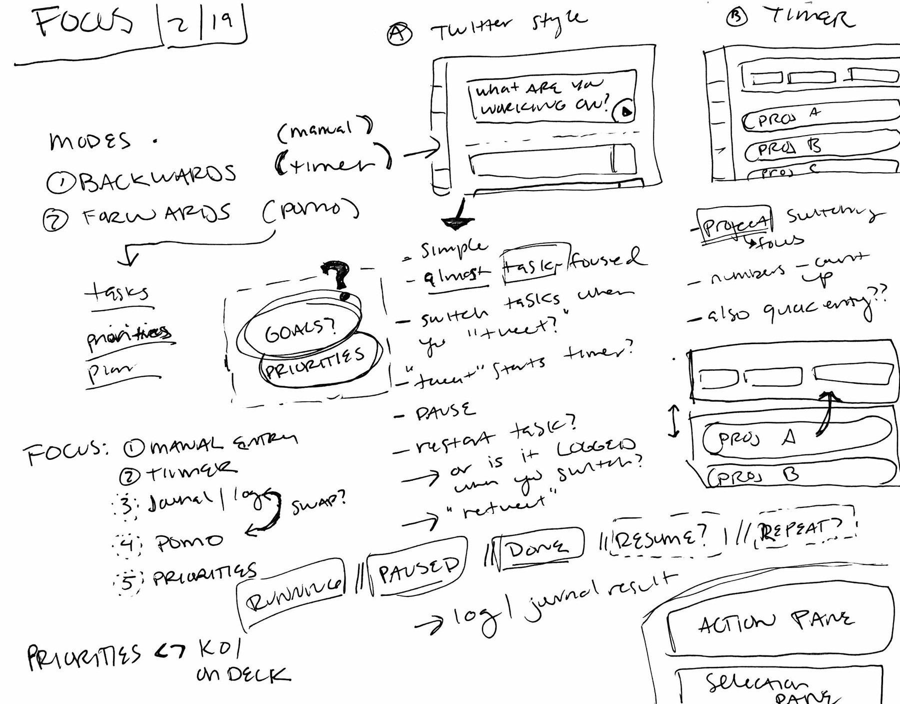
And turned into a wireframe…
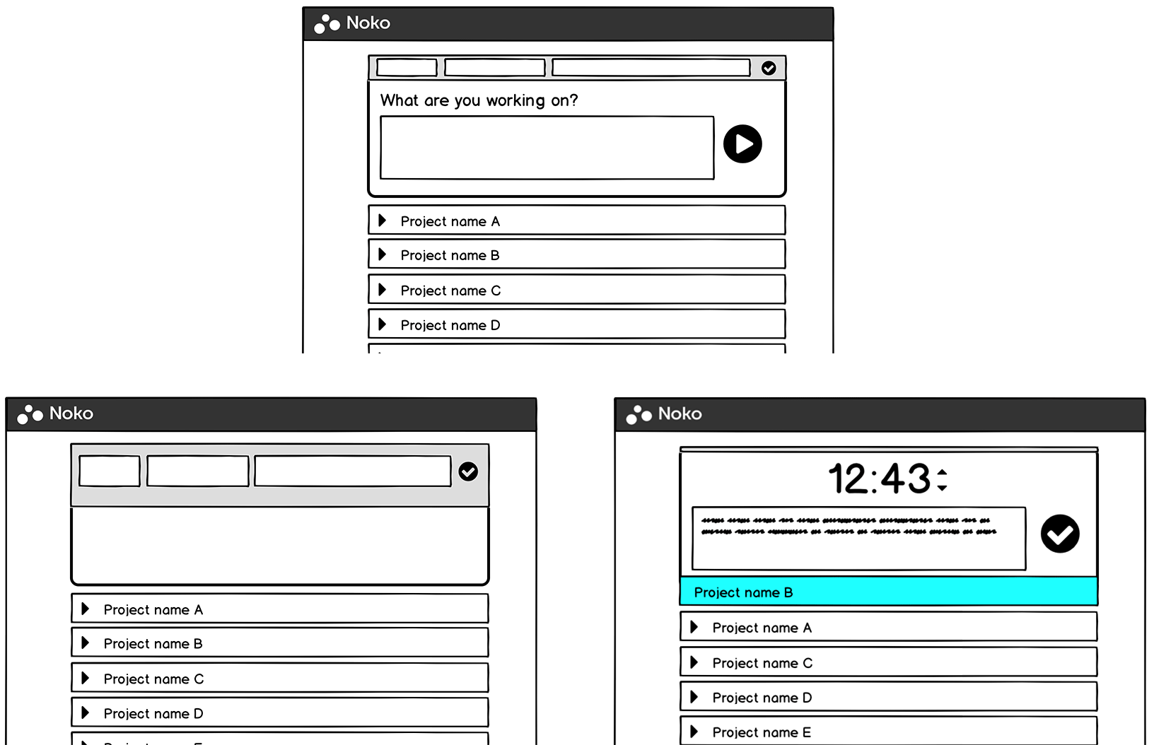
The interface metaphor is split: “Time tracking happening” in the Focus box up top, and selection down below. It’s sort of modal… if you select the manual time entry form, the form will expand, and the area below will show your entries as you make them in rapid-fire… or you can begin a timer by typing what you’re doing (like a tweet!) and select a project at a later point, or you can click a project and get a blank note field with your timer, which is how the timer works now.